Bell Centennial - Form & Function: A detailed look at the telephone book typeface, by Nick Sherman

In 1976, AT&T commissioned the design of a new typeface whose sole purpose would be for use in their telephone directories. The design had to solve multiple technical and visual problems related with the existing phonebook typeface, Bell Gothic. The solution, named in honor of the company's 100th anniversary, was Bell Centennial.

Bell Centennial specimen

Bell Centennial is a family of four weights, designed by Matthew Carter at Mergenthaler, to take advantage of the then-newer composing and printing technologies, while still compensating for the limitations that did exist.

Bell Centennial is a condensed sans-serif design that maintains legibility at very small sizes, allows for clear information structures, is economical on space, and accommodates for adverse production conditions; all while keeping to an intended typographic style.

Since the intended final use was so specific, the restrictions on the design were extremely stringent, down to the minimum thousandth-of-an-inch in stroke weight, but this was all solved through careful planning and extreme attention to detail.


Bell Centennial's Predecessor: Bell Gothic

The importance of typography was nothing new to AT&T. In 1894 they had switched from hand set type to the Linotype compositor for their letterpress printing; And by 1915 they had engaged “type experts” who worked with the Linotype company to develop typefaces suited for setting directory information.

Chauncey H. GriffithApparently that wasn't enough though, because in 1937, Chauncey H. Griffith (1879–1956, bio), then Vice President of Typographic Development at Mergenthaler Linotype, set out to create what, starting with Manhattan's Fall 1937 directory, would be the typeface used in phone books for the next 40 years: Bell Gothic.

Bell Gothic consisted of two weights, each serving a different purpose: Bold was used to list subscribers' names and numbers, and Light was used for setting addresses.

Bell Gothic specimen

Bell Gothic worked fine when the directories were still being composed in hot metal on a Linotype machine and printed on a letterpress, but because it was designed for those production methods, it didn't hold up under the set of limitations presented by newer technologies. Typographic composition was being done photographically with Cathode Ray Typesetting (CRT), and the printing done on high-speed offset lithography presses. These production methods greatly affected the typeface; letterforms (especially in the Light face) broke apart: its strokes became lighter, sometimes eroding completely at the intersections of straight and curved strokes.

For a time, printers tried to compensate for this erosion by over-inking the printing plates; while this helped to thicken the strokes, it brought up a whole new set of problems. Legibility suffered as the already condensed letterforms closed in on themselves. The strokes of different characters ran into each other, making c and l become d; r and n became m; 3 looked like 8; 5 looked like 6. Another problem with over-inking was that the presses had to be stopped frequently for additional cleaning which cost printing time and production money.

It was apparent that a new typeface had to be designed to work with the newer technologies instead of trying to force Bell Gothic to work under circumstances for which it was not designed.


Bell Centennial & Technology

The phone book's production methods greatly affected the design of Bell Centennial. To start with, CRT composition removed the limitation imposed by the Linotype requiring the same letter in different weights to be the same width; i.e., the light M no longer had to be the same width as the bold M.

With this freedom, Carter was able to improve the clarity of visual hierarchy between all weights in the family. He made the Name & Number face heavier and wider, increasing its prominence over other information. Also, the width of the less prominent Address face was decreased; a reduction that would more than make up for the added width of the Name & Number face. This allowed more information to fit in a small space, thus saving paper, print time, shipping, and consequently, huge amounts of money.

The CRT method of typesetting also required an increase in stroke width to prevent the letterforms from breaking apart. It was specified that “any individual lowercase character used for Name & Number shall have a vertical stem of no less than 0.008 inch”.

g drawn on a quadrille gridSince CRT rendered each letter at about 850 lines per inch, the strokes of the lightest characters varied between only 4 and 6 scan lines. This made every single scan crucial to the outcome of the letter, both regarding legibility and compensation for variations in production.

To maintain total control of the final rendering of his new typeface, Carter took on the laborious task of designing each character for the exact size (6 point) and resolution at which it would be ultimately produced. This involved creating every character, pixel by pixel, on quadrille grid paper. According to Carter, the presence or absence of one tile on the grid could greatly affect the perception of a curve's shape or a stroke's angle when viewed at the target size.

The drawings were encoded by hand and proofs were then made on Mergenthaler's Linotron 606 digital typesetter. From there, the digitized typeface was provided to Autologic and Information International (two companies whose typesetters were widely used by Bell) for conversion into proprietary font formats that would work best with their typesetting equipment.

Though Carter designed all of Bell Centennials forms, a man named Alex Kaczun (profile) is attributed to wrapping the shapes with bezier curves to create the vector-based font in use today.


Bell Centennial's Forms, Style, and Clarity

Since Bell Centennial was designed for such specific purposes, its forms are very unique. Some serve technical purposes that improve reproduction, some deal with legibility issues, and some act as stylistic devices.

Saul Bass with his AT&T logo
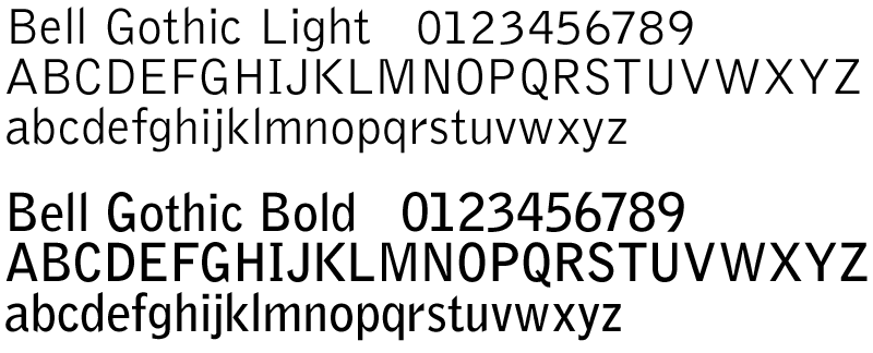
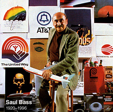
AT&T wanted the new typeface to have more of a modern feel to it; one that would work well with Helvetica (history), the typeface used at the time in the AT&T corporate identity developed by Saul Bass (1920–1996, bio). Though formal changes were made to better match Bell Centennial with Helvetica (i.e., the slanted stroke ends in Bell Gothic became squared), the new face would not simply be an adaptation.

The main problem with Helvetica was that its forms lost some functionality at the small sizes used in the phone book due to its closed letter shapes.

The new typeface, above all else, had to be very legible at small sizes (6 point, to be exact) – especially the numbers; according to Carter, the most valuable aspect of Bell Centennial is allowing for this by using very open forms. To do this, Carter emphasized counter space by using square cut terminals on letters with curved strokes, like in the a, c, e, g, and s. He also increased the white space of the letters by not using horizontal terminals, as well as straightening and shortening curves in characters like g, y, r, e, C, G, J, S, 3, 5, 6, and 9.

The letters were allowed a bit more breathing space as far as letterspacing which prevented characters from bleeding together on the page.

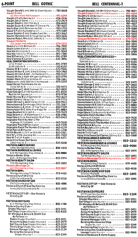
Obviously the numbers of Bell Centennial played a crucial role, so Carter made sure to create a clear distinction between numbers with similar forms like 5 and 6, or 3 and 8.

ink traps highlighted on N
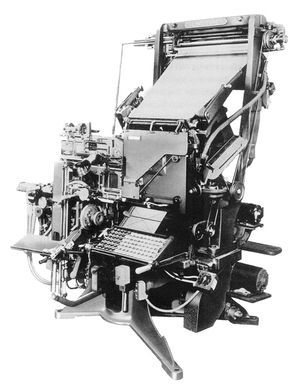
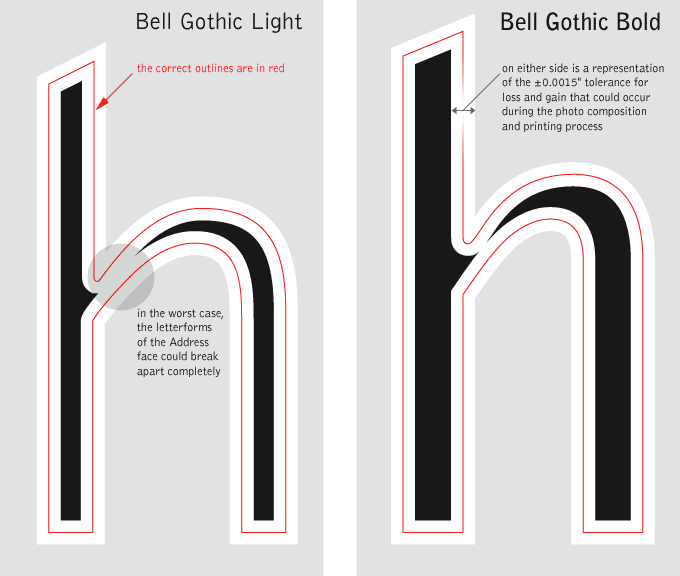
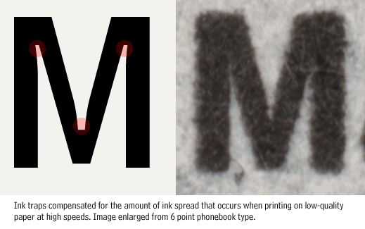
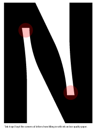
Maybe the most unique of Bell Centennial's forms are in place to solve problems during production. Since the phonebook is printed at high speeds and on low-quality paper, the ink has a tendency to spread out on the paper (this effect is called “dot gain”). Since the slightest spread greatly effects the shape of such small letterforms, Carter incorporated notches (called “ink traps”) at the corners for compensation.

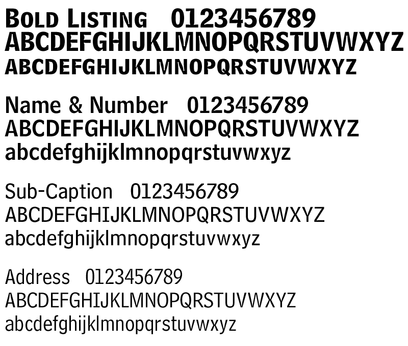
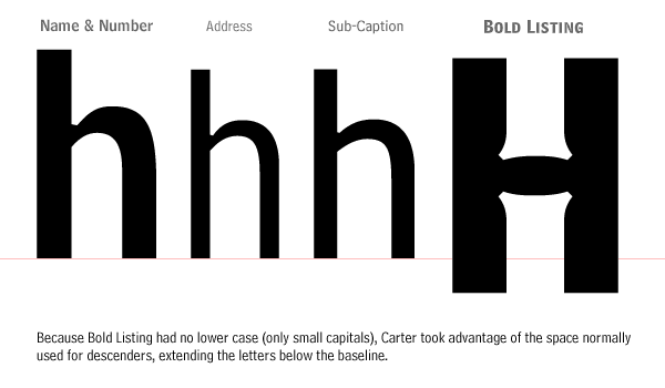
Bell Centennial introduced two new weights to the phonebook, allowing more depth in hierarchy and opportunities to highlight special listings.

Predicting that advertisers would pay extra money for increased visibility, a Bold Listing weight was developed. It did not have lowercase characters and had an exaggerated capital height – sitting below the baseline and utilizing the space normally used by lowercase descenders. An alternate version was also developed to sit on a standard baseline. [note: it appears as though the alternate version of Bold Listing has been abandoned in the OpenType version of Bell Centennial; instead, the Bold Listing weight now sits on the standard baseline by default.]

It was apparent in test settings that Bold Listing required a companion font – one that was somewhere in between Address and Name & Number. Sub-Caption was developed, and proved helpful in giving additional information about advertisers or in listing entries for large institutions with multiple departments and numbers.


Bell Centennial In Use

Although intended for small print and lists, Mazda UK used Bell Centennial at huge sizes to striking effect in a mid-1990s ad campaign, as did the English National Opera to advertise their production of Katya Kabanova.

I am always interested in examples of the use of Bell Centennial (especially non-phonebook) to show as samples here; if you have any or know of any, please don't hesitate to let me know.


Links and References

Main sources for this article

Typecase – Bell Gothic & Bell Centennial by Andrew Boag
first published in Linotype’s “Letterbox” #7, 1990
online through http://www.boag.co.uk/more/articles.html
or directly at http://www.boag.co.uk/more/articles/Bell.PDF

Typographically Speaking: The Art of Matthew Carter
Bell Centennial essay by Margaret Re, boards by Matthew Carter
Princeton Architectural Press, 2003
available on Amazon.com

20th Century Type Designers by Sebastian Carter
W.W. Norton Company, 1995
available on Amazon.com

Bell Centennial page at the Adobe Online Type Library
http://store.adobe.com/type/browser/P/P_1295.html

Alex Kaczun profile at MyFonts.com
http://www.myfonts.com/person/kaczun/alex/

External links that appear in this article

Matthew Carter profile at fonts.com
http://www.fonts.com/AboutFonts/DesignerProfiles/MatthewCarter.htm

Chauncey Griffith profile at MyFonts.com
http://www.myfonts.com/person/griffith/chauncey/h/

Linotype machine information at Wikipedia
http://en.wikipedia.org/wiki/Linotype_machine

History of Helvetica at frieze.com
http://www.frieze.com/feature_single.asp?f=720

Saul Bass biography at the Design Museum
http://www.designmuseum.org/designerex/saul-bass.htm

Saul Bass film titles at Not Coming To A Theatre Near You
http://www.notcoming.com/saulbass/index2.php

Page containing information on Alex Kaczun at Galapagos Design
http://www.galapagosdesign.com/original/newren.htm

Bell Centennial Family at the Linotype Library
http://www.linotype.com/121/bellcentennial-family.html

Other links of interest

History of the Bell System logo at Bell System Memorial
http://www.bellsystemmemorial.com/bell_logos.html