Image courtesy of Letterform Archive
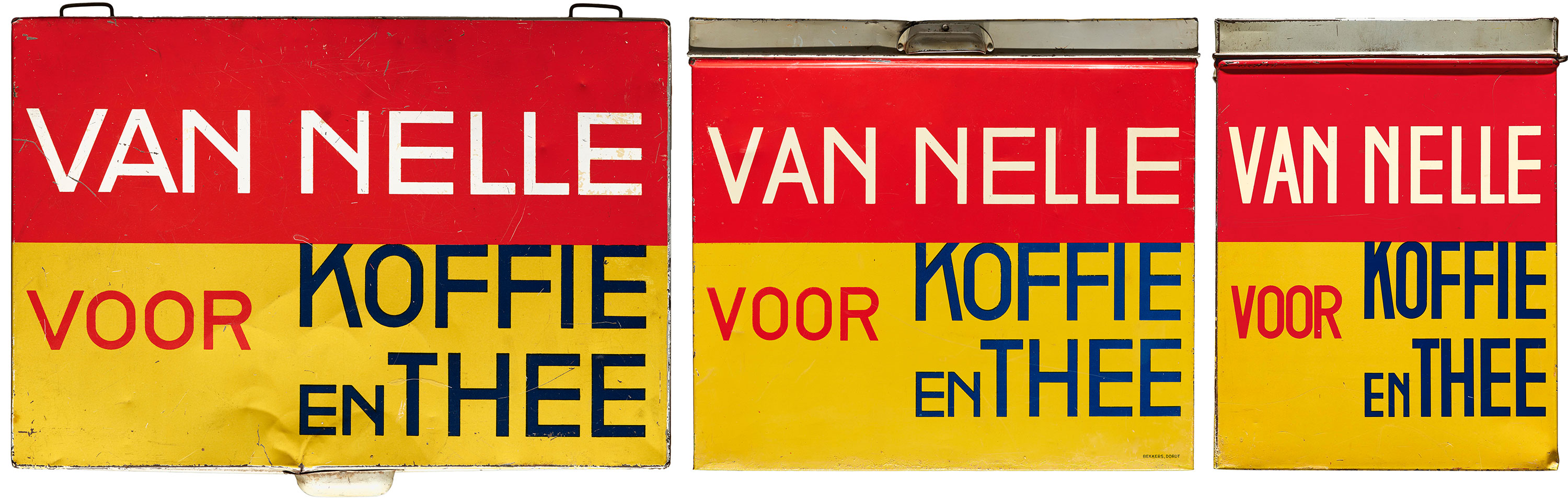
This page shows a variable / responsive design interpretation of the sides and top of an old Van Nelle coffee and tea tin, designed circa 1930 by Jacob Jongert.
The various widths of lettering on the original tin were interpreted as a variable font with a width axis by Nick Sherman. The font adapts to the page’s dimensions using an upcoming variable-font-friendly update to the Font-To-Width script by Chris Lewis.
Note that the font isn’t being artificially stretched to fit, but is adjusting automatically within the typeface’s range of designed widths. Also note that you will need to view the page in a browser that supports variable fonts to see the effect properly.
Many thanks to Letterform Archive for sharing images of the original tin. Learn more about Jongert and their collection of his work. More images of the tin are also available from MoMA.
The typeface used for this body text is Lauweriks, a work in progress by Nick Sherman, inspired by lettering from J.L.M. Lauweriks (a contemporary of Jongert’s).
Image courtesy of Letterform Archive