After I felt like I had seen enough things to inform my solution, and even as I was still exploring, I began to make quick sketches which would slowly grow over time into a cohesive final idea.
While most of these digital sketches are downright ugly, as far as aesthetics go, I was more interested in solidifying some good ideas.
Meta tags
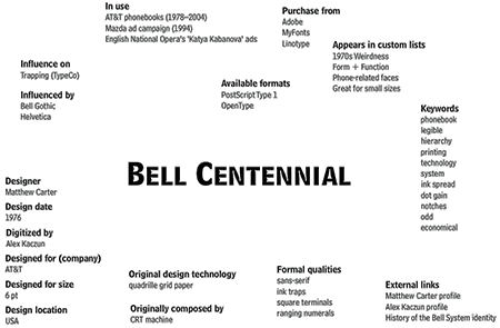
I knew right away that no matter what I came up with as a final tool, it would require the use of a large set of meta tags. Each typeface would begin to be defined not by one linear, objective property, but with a combination of various different kinds of tags and keywords.
In other words, each typeface would carry around with it a proverbial backpack full of data goodies. Of course I had to begin to define at least a general list of what these defining tags would be. Below are SOME of the more crucial ones; to the right is a more exstensive list which I developed.
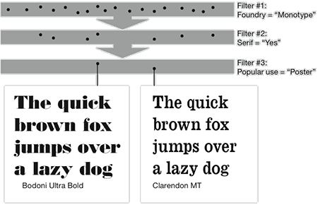
progressive Filtering & Process of Elimination
Of course, no database is usefull unless you have an appropriate search or browsing method. So that was the natural next step after defining the data.
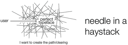
I had plenty of research under my belt in this area, but I made a few sketches to get the ball rolling. I found ultimately that what I was creating in a very basic sense was a search tool; one that would eliminate irrelevant information (typefaces) in order to connect the user with their ideal typographic solution.
The next few sketches are pretty straightforward—basically just dealing with / thinking about filters or other types of progressive searches or selection.
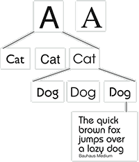 One less exacting method I played with a bit involves a visual journey through small sets of options. I found it too be too broad though and it required too much conceptual though to understand different similarities between the typefaces
One more promising approach to filtering however came as an inspiration from Apples Finder search. Different filters are combined, which allows the user to find very specific things or more broad things if they want.
Below for reference is a sketch I did of how I imagined

Timeline
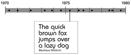
What filtering sketches would be complete with out a good ol' timeline? I have always been interested in typography in relation to time, but unfortunately using a timeline limited a lot of the other more subjective things I wanted to hit.
Satellites
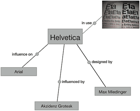
Things really began to pick up after I started looking at some alternative ways of linking chunks of data. As in the sketch below, a lot can be done with a few lines and boxes to help people understand complex inter-relationships more easily.
Venn Diagrams
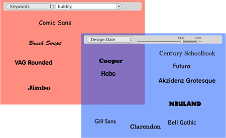
Another idea I came up with utilized multiple existing informational metaphors. This sketch takes the overlapping effect of a Venn diagram and doubles it with the various different filters I envisioned at the time.
One of the intermediate steps I took during development was to write a quick user scenario. This helped a lot to explain to people exactly it was that I wanted to create.
John is a designer, working at a small–medium size design firm. He has been assigned to design materials that will accompany a play version of Dracula. This includes tickets, posters, programs, etc.
He wants a text typeface that he can use for the printed info that will carry the feel of the story, but he doesn’t have the time to browse through his unnecessarily large library of typefaces.
So he opens Type Search.
He enters “horror” in the keyword field, but finds that so many of the results are novelty display faces. So he adds a “Use” filter, and selects “text”. This narrows his search, but he finds many of the faces to be overly exaggerated.
So he removes the “horror” keyword and replaces it with “spikey”. The results narrow down to about 100 spikey text types. A lot of these are very post-modern though, and he wants an older, antique look. So he adds a “Movement” filter and selects “Victorian”.
His results are narrowed down further, but maybe a bit too far, since he is only left with 2 choices. He would be happy to use one of these, but is curious to see if there is anything similar he might like better that may have been eliminated by one of his filters. So, he slides the “Relevance” filter down to include more faces that almost made the initial cut.
Here he finds a face that isn’t so obviously Victorian, but has the perfect amount of “spike”. He can’t believe he has never seen this face before. He immediately falls in love with the capital D, and uses an abstraction of it in his promotional poster.
![]()
Skeleton wireframe, including Wiki Articles
As my ideas began to solidify, I figured it wouldn't be a bad idea to design the guts of the system and how it would work... what kind of information could be given to the user.
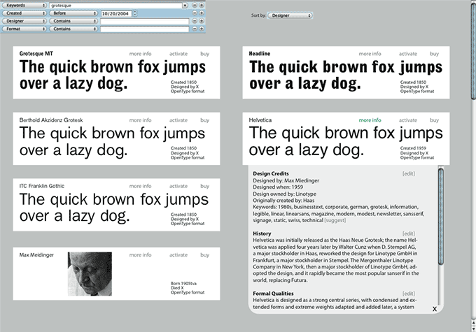
Even though I built this image as almost instructions of what to include in the final, there is a certain simplicity in it which I am attracted to.
INTERFACE SKETCHES
Eventually, believe it or not, I did get around to some complete rough sketches. I won't say too much about this first one, as the logistics behind it were too much of a headache to deal with.
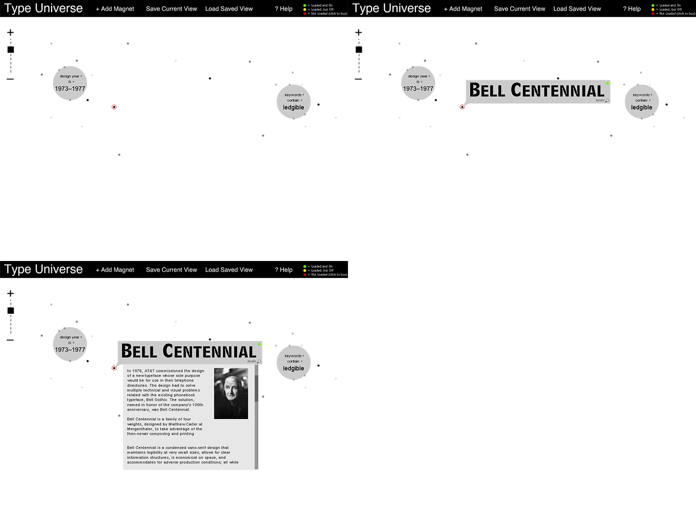
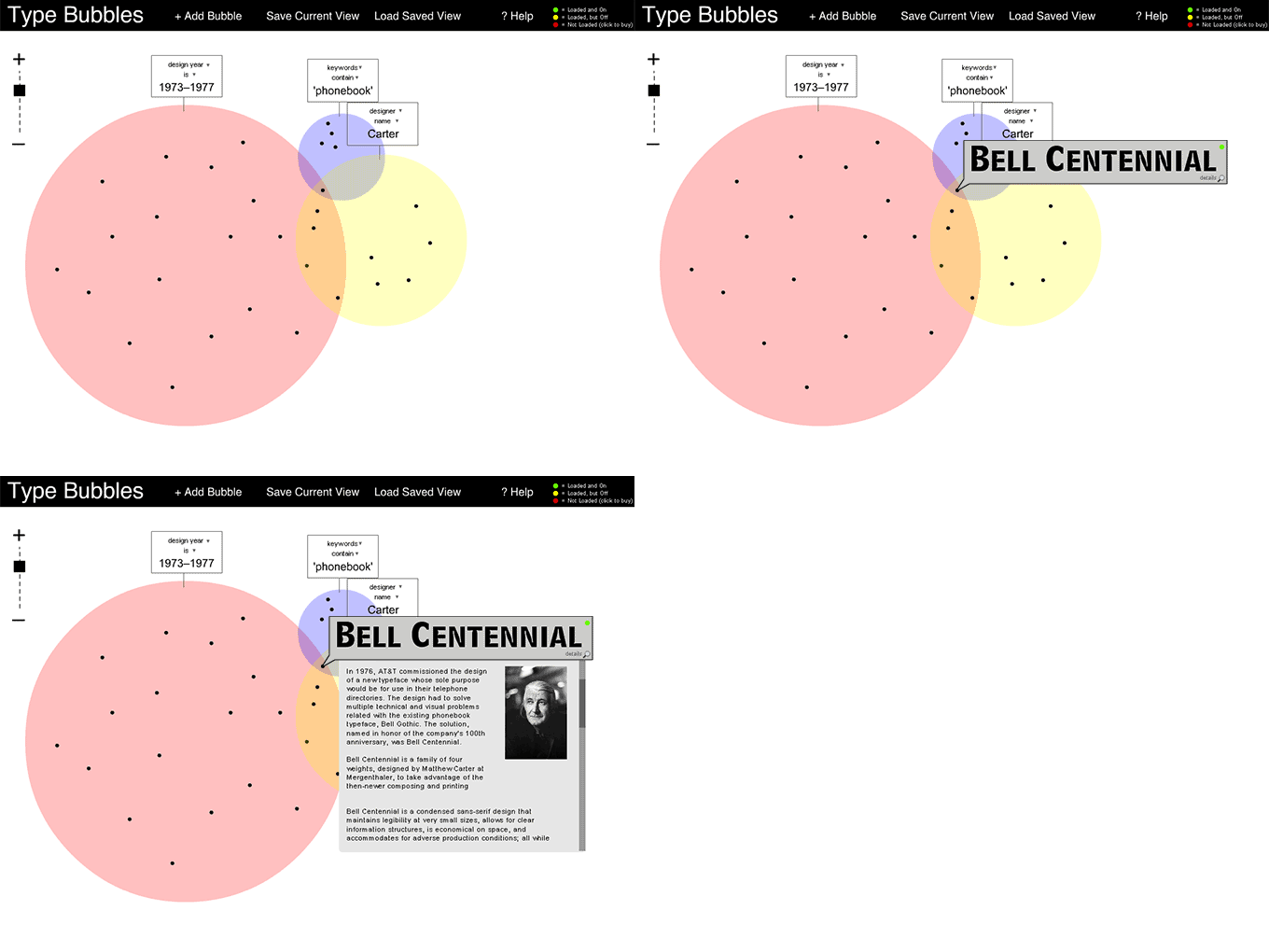
The next one, which I mamed Type Bubbles is much easier to get a grasp on mentally and I think has more potential in a broader market. I realized after I completed this sketch that it wasnt much mure than some glorified Venn diagrams. I think that's probablyl a good thing.
One of the last things to be done in class was to write a few short essays which were based to Bruce Mau's Incomplete Manifesto for Growth. I especially enjoyed writing in response to his statement urging people to stay up late, since I have been doing a lot of that lately.
If I’ve learned about one thing over the past few months, it would be the skill of sleep deprivation. As of today, I have been tracking my sleep hours for the past 31 days. In the past month my average time slept per day has been 5 hours, 11 minutes. The average amount of time I spend asleep in one stretch: 4 hours, 28 minutes.
I don’t think a schedule as extreme as this was exactly what Mau was suggesting—though I do wonder. After all, it is reported that Leonardo DaVinci’s sleep schedule consisted of regularly spaced naps throughout the entire day and night, which ultimately lead to less total hours of sleep.
I could talk forever about the science of sleep deprivation or how it makes my hair hurt, but maybe more interesting is the effect it has on my creative growth. When I’ve been up for 2 days I enter a state of what I can only describe as surreal zombification. My logic is so skewed that I begin making conceptual connections that, in all honestly, don’t have any base in reality whatsoever. Like Mau says: “Strange things happen when you’ve gone too far, been up to long, worked too hard, and you’re separated from the rest of the world.”
Strange things do happen, indeed. Sometimes they’re good—sometimes maybe not so good—but the point I think is most important is that they are different. Some people love their sleep and can’t live without it; I have nothing against these people. For me, however, a life of consistent slumber lacks a certain twist that can only be drawn out with utter exhaustion.
Maybe I just wasn’t designed to rise and set with the sun.
![]()
For this statement, I will have to disagree with Mau. It has something to do with the absolute wording that he chose. There are without a doubt times when process is indeed more important than outcome; certainly what we learn along the way often takes precedence over the success of the final product.
But what of the times when the process is that there is no process? Spontaneous creative combustion can yield some amazing results.
And of course, as Brian Lucid says: “You can’t eat the recipe.”
If I was assigned to design something that could potentially save someone’s life, I would say beyond the shadow of a doubt that the final outcome is 100% more important than the process involved to get there.
![]()
All this leads to: THE SOLUTION!