Once I knew what problems I wanted to solve, I had to familiarize myself with anything that might aid me in my solution.
I love this stage in any design project—it makes full use of my infinite attention span. For some reason I tend to throw myself head first into any subject that I'm even remotely interested in, so when it was time to research something I'm as passionate about as typographic classification or the visual display of complex information, etc, I went a little overboard.
Classification Systems
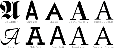
One of the big areas of my research was in existing type classification systems. There are a variety out there, some more successful than others, but most all were either extremely linear or one-dimensional (eg: date, formal qualities, or even alphabetic order).
Adobe and many other type vendors group their fonts according to formal qualities. One of the problems with a system like this is that some of the more subtle distinctions, say between Garalde and Venetian Oldstyle, are indistinguishable to the amateur eye.
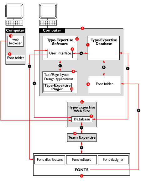
What I was searching for was a multi-dimensional system of typographic classification. The best thing I found, by far, is a project that is still in development by the Type-Expertise group, called the Universal Font Classification System (UFCS). The UFCS concept, up to this point, is the only multi-dimensional system I know of. Their system allows users to update an online classification database with grouping, keywords, suggestions, etc for their typography.
For more detailed information please check out their site!!! It was a great motivator for me as I developed my project to learn that I was not the only person who was so passionate about the need for a new font classification system.
Specimen Sheets & Font Management Software
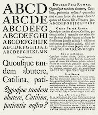 The next area to research was how typefaces are display and browsed. This topic goes back as far as Gutenberg, so there was plenty to learn about here. What I was specifically interested in was how typographic libraries were browsed in the digital realm. It was great fun to look at old printed specimen books (I probably spent more time than neccessary doing so), but unfortunately it didn't relate too much with the world of digital type.
So I began my journey through the world of tools that browse and manage a library of type digitally. Most of what I found was painfully basic—giving roughly the same amout of information (sometimes less) as the specimen books of old, but without the charm and beauty.
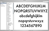 The first thing I looked at was my own computer; I had been using the FontBook program which is built into the Macintosh operating system. FontBook is pretty similar to Adobe's Type Manager—they both allow a view of each face with the added ability to create custom collections of fonts to be turned on and off together.
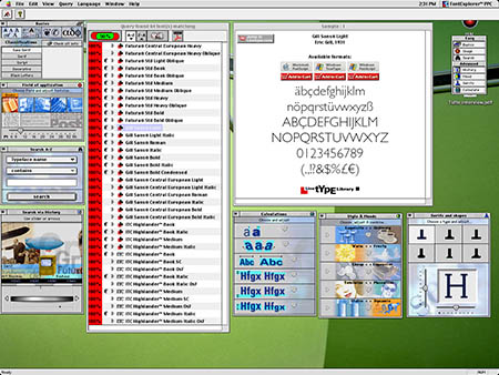
One of the most interesting programs I ran across during research was an early version of Linotype's FontExplorer. The program file was HUGE and could only run in OS 9, plus the interface was horribly cheesy, but the thinking behind it was right on the path of what I had been thinking: the ability to browse by using a relatively deep set of properties.
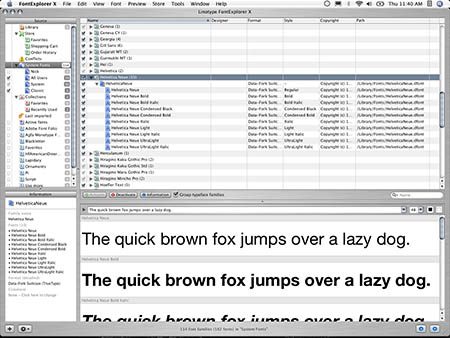
Since then, Linotype has updated FontExplorer to version X. This is what I currently use for my own type management. The new interface is a blatant take on Apple's iTunes music program. The program has dropped most of the qualitative search aspects from the earlier version, but still offers more functionality than most font managements programs.
Online Typography Searches
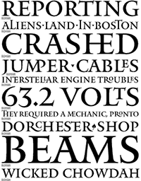 Another good resource to get inspiration was the many web sites in existence which deal with the same digital type that I had proposed to work with. In particular, the searching and tagging functionality on these sites informed many of the decisions I would be making.
First off, I would like to give an honorable mention to Boston's own Font Bureau for utilizing type specimens on their web site which are beautifully designed—a pleasant change from most online type vendor's monotonous 'Quick brown fox' solution. The samples are a worthy salute to the lovely printed specimen sheets of old (see above).
Though browsing the Font Bureau catalog is about as linear as you can get (users either choose the typeface name from an alphabetized drop-down list, or get a guided tour using back and forward buttons), it is well designed and really allows the typfaces to shine.
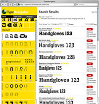 One interesting type search tool is FontShop's TypeNavigator, developed by Hanjörg and Robert Stulle. It filters from a database to return results to the user based on selected variables (contour, width, contrast, designer name, etc). Nicely done, however I am skeptical about how many people search for typefaces based on specific geometric qualities (width, etc). To me it seems more relevant to tag qualitative keywords to typefaces; and beyond let, allow the public define the keywords.
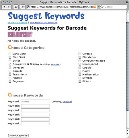
Which leads me to my next example: MyFonts.com. At first glance, most professional designers are probably turned off by the MyFonts visual aesthetic; but under all those cheery gradients, bubbly illustrations, and garrish headlines is a pretty powerful typographic database.
The great thing about MyFonts is that they allow anyone to suggest keywords for different typefaces, which results in a wonderful collection of words (ie: 'frogger', 'ramen', or 'necromancer') by which any person can search.
They also link typefaces with a small article on the designer and give a nod toward the actual foundry, which is nice.
Another great resource provided by MyFonts is their sub-site, WhatTheFont. Here users can upload images of a typeface and get recommendations as to what typeface it might be. This is good if you see a face you like but have no idea what it's name is.
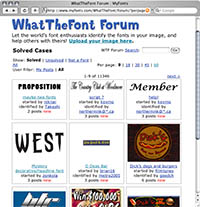 Finally, WhatTheFont also has a forum if the previous analyses fail: users upload images and get hints to the face's name from other real-life users. This, I believe, shows the huge potential for what can be done with a community of type-lovers.
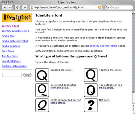
On the font identification topic, Identifont allows you to go through a type questionaire, giving specifics about certain formal characteristics of your unnamed face (what the tail of the Q looks like, etc). The answers lead you to a small set of possible faces.
Visually Displaying Multivariate Information
Finally, I spent a lot of time looking at other displays of multivariate information, be it type-related or not.
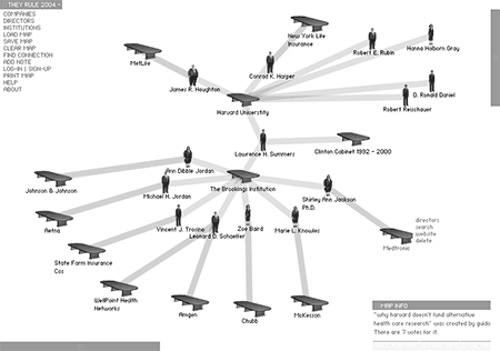
One of my favorite examples, showing complex interconnections in the world of corporate power, is theyrule.net. The biggest aspect of this site which I adopted for my own visualization was the ability to save views to share with other users.
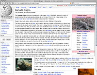 One of the biggest influences on the thinking behind my classification system was Wikipedia. Wikipedia is an online encyclopedia which is maintained entirely by the public. Users can add or edit content of any article, adding their own insight or removing irrelevant information posted by other users.
The wiki method, I believe, is the best way to create categorization or definitions, as it is never set in stone and can change over time.
Next stop: development.

